If you realize how most people act and think, you can tell them lies while telling the truth. Which is what people are usually trying to do when they start graphs away from zero.
Or it’s removing white space so you can actually see the difference in the data. Like stocks, if stocks started at zero, you wouldn’t be able to see day to day or even a week to week difference…. Not everything can be covered by general rules.
You can only properly understand the data by reading it, if you glance at it and make assumptions and conclusions, that only speaks volumes about yourself.
If counting from 1 to eleven is too hard for you, I don’t think observing that the scale is from 7 to 11 is within your grasp. So, why do this. Absolutely, there are reasons to not start a scale from zero, stocks are a great example, but I don’t think those reasons apply to this graph or the information they’re trying to convey.
you say that as if everyone analyses every aspect of everything they encounter. most people will glance at the graph, see a huge jump, and not look into it more. that’s why statistics are so easy to falsify or make misleading
If you want to engage in a conversation or use that information, yes you should properly read it. What could possibly be added to a discussion otherwise? Just having people have to correct and call out your bullshit? Lmfao.
Since you are engaging in comments within a post about this, everyone would assume you read the graph properly, since you obviously can’t add to a conversation without actually knowing the information.
So yes, leave your idiocy elsewhere next time, read the shit, or don’t add your opinion, really simple concept.


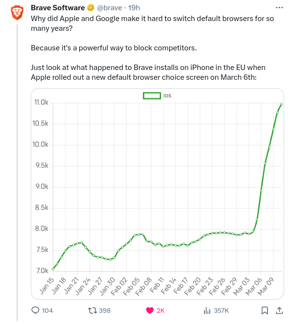
Misleading graph trying to make a 150% increase look like a 1000% increase.
that’s a ~40% increase looking like a 300% increase
Read the left side? 7k-11k, the removed useless information, provided you read what is actually there first.
no one reads that. didn’t even bother to look. should be more transparent IMO but whatever
If you don’t how are you supposed to know what information it’s telling you? It could shades of purple for all you know.
If you realize how most people act and think, you can tell them lies while telling the truth. Which is what people are usually trying to do when they start graphs away from zero.
Or it’s removing white space so you can actually see the difference in the data. Like stocks, if stocks started at zero, you wouldn’t be able to see day to day or even a week to week difference…. Not everything can be covered by general rules.
You can only properly understand the data by reading it, if you glance at it and make assumptions and conclusions, that only speaks volumes about yourself.
If counting from 1 to eleven is too hard for you, I don’t think observing that the scale is from 7 to 11 is within your grasp. So, why do this. Absolutely, there are reasons to not start a scale from zero, stocks are a great example, but I don’t think those reasons apply to this graph or the information they’re trying to convey.
Yeah… it just doesn’t work with the given information, there is actually a reason why they specifically posted the other one….
well yea but this also isn’t like important stuff so I didn’t bother looking
So keep your idiocy to yourself next time.
you say that as if everyone analyses every aspect of everything they encounter. most people will glance at the graph, see a huge jump, and not look into it more. that’s why statistics are so easy to falsify or make misleading
If you want to engage in a conversation or use that information, yes you should properly read it. What could possibly be added to a discussion otherwise? Just having people have to correct and call out your bullshit? Lmfao.
Since you are engaging in comments within a post about this, everyone would assume you read the graph properly, since you obviously can’t add to a conversation without actually knowing the information.
So yes, leave your idiocy elsewhere next time, read the shit, or don’t add your opinion, really simple concept.
Welcome to the transparency of Brave !