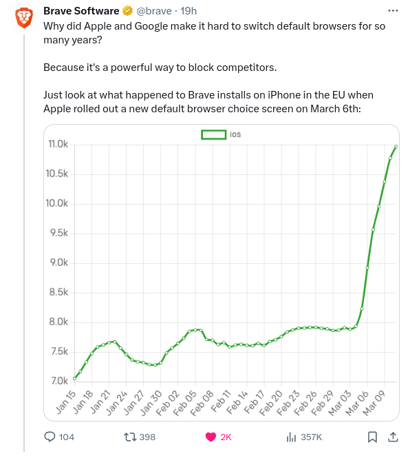
FatCat@lemmy.world to Technology@lemmy.worldEnglish · 4 months agoThe DMA already having an impact. Brave Browser installs surge after introduction of browser choice splash screen on iOS.lemmy.worldimagemessage-square277fedilinkarrow-up11.16Karrow-down175file-text
arrow-up11.09Karrow-down1imageThe DMA already having an impact. Brave Browser installs surge after introduction of browser choice splash screen on iOS.lemmy.worldFatCat@lemmy.world to Technology@lemmy.worldEnglish · 4 months agomessage-square277fedilinkfile-text
minus-squareRoss_audio@lemmy.worldlinkfedilinkEnglisharrow-up20arrow-down40·4 months agoNo it doesn’t. It’s meant to illustrate a change and it does so perfectly fine. It’s not a scientific paper. It’s a 32-34% increase looking at the graph. That’s significant enough to shout about. Imagine any change you could make surprising competition by 25% in any market. That’s huge.
minus-squareSorteKanin@feddit.dklinkfedilinkEnglisharrow-up44arrow-down4·4 months ago It’s meant to illustrate a change and it does so perfectly fine Define “perfectly fine”. It is clearly exaggerating the change. At a glance it looks more like a 5 times increase, not a 30% increase.
minus-squareArtVandelay@lemmy.worldlinkfedilinkEnglisharrow-up10arrow-down1·4 months agoOf lies, damned lies, and statistics this graph is certainly one of them.
minus-squarePotatos_are_not_friends@lemmy.worldlinkfedilinkEnglisharrow-up17arrow-down3·4 months agoDid you know that disco record sales were up 400% for the year ending 1976, if these trends continue…AY!
minus-squaregeissi@feddit.delinkfedilinkEnglisharrow-up13arrow-down1·edit-24 months ago It’s a 32-34% increase looking at the graph But you don’t get that percentage from looking at the graph. You get that from looking at the numbers. The graph height increases by 300% in the last 3 months 9 days.
minus-squareHobbes@startrek.websitelinkfedilinkEnglisharrow-up1·4 months agoYou could say the same about a 0.001 difference if you zoom in on the y-axis. You don’t know what you’re talking about.
minus-squareRoss_audio@lemmy.worldlinkfedilinkEnglisharrow-up1·4 months agoA 0.001 difference on a 0.004 total would be worth showing.
minus-squareHobbes@startrek.websitelinkfedilinkEnglisharrow-up1arrow-down1·3 months agoThat was a bad example. Try 1,000,000 moving up to 1,000,069.
minus-squareRoss_audio@lemmy.worldlinkfedilinkEnglisharrow-up1·edit-23 months agoI’m sticking with relevance. A >25% rise is what we’re talking about.
minus-squareHobbes@startrek.websitelinkfedilinkEnglisharrow-up1arrow-down1·3 months agoA 25% raise would show up with the y shits at zero. As would any significant increase.


No it doesn’t.
It’s meant to illustrate a change and it does so perfectly fine. It’s not a scientific paper.
It’s a 32-34% increase looking at the graph. That’s significant enough to shout about.
Imagine any change you could make surprising competition by 25% in any market. That’s huge.
Define “perfectly fine”. It is clearly exaggerating the change. At a glance it looks more like a 5 times increase, not a 30% increase.
Of lies, damned lies, and statistics this graph is certainly one of them.
Did you know that disco record sales were up 400% for the year ending 1976, if these trends continue…AY!
But you don’t get that percentage from looking at the graph. You get that from looking at the numbers.
The graph height increases by 300% in the last
3 months9 days.You could say the same about a 0.001 difference if you zoom in on the y-axis. You don’t know what you’re talking about.
A 0.001 difference on a 0.004 total would be worth showing.
That was a bad example. Try 1,000,000 moving up to 1,000,069.
I’m sticking with relevance. A >25% rise is what we’re talking about.
A 25% raise would show up with the y shits at zero. As would any significant increase.
True.