
Hi everyone!
I’m an Industrial/Product Designer in my professional life, and I was so inspired by @UrLogicFails’s fantastic new community icons that I wanted to try out some of my own design ideas for Beehaw.

First, I tried my hand at an icon for Beehaw. I’m endeared to the little pixelated bee-cowboy we have now, but my background is in cleaner, more minimal designs that are easy to deploy to lots of different devices. A good logo sets a good first impression, and I want new users to see Beehaw as a real, legitimate alternative vision for social media. I’ve tried to recreate the back of a bee, and used the wings to form a subtle letter “B.” My personal favorite is the hexagon bestagon, but I have both iOS and Android variations. Icon design is always really contentious, but it’s also really fun - I’d love to see other people’s ideas!
Second, I took a stab at tweaking the design of Beehaw, with the goals improving the layout and padding, introducing a more consistent color scheme, increasing legibility, and (of course) incorporating more bee elements. I’m working on a CSS theme that incorporates some of these changes, but others are beyond the scope of CSS injections and will require actual work on Lemmy-UI.
Light Theme:


Dark Theme:


I’d love to hear your thoughts, and I’m happy to share more if people are interested :)
Thanks for viewing, take care!
Hey there. This is beautiful work!
I can’t speak for all the other admins but I have strong opinions on the logo. To me, the logo needs to be both bee and haw and I don’t want it to feel watered down or presented in a way to be appealing to all the masses. To me it’s meant to be cute, radical, and kinda in your face with it’s absurdity. I don’t think it can be done in such an abstract way without losing too much character. But that’s just my 2c.
The themes are quite clean, however, which is definitely what I think we need to reduce visual clutter and make things easy to find. Thank you so much for putting this all together, it’s great work!
Thank you for the kind words! I agree, I said in another comment but this is all “bee” and no “haw” in a way I figured wouldn’t quite fit the feeling of the site. My design practice is unfortunately so “commercial” that it’s hard to get my preconceived notions of icon design out of my head. Balancing approachability and character is tough! If I do another round, I’m gonna somehow get a cowboy hat in there haha
I love the dedication and can’t wait to see it! 💜
I think the logo is cool and I like the dark theme a lot! If I can provide one constructive comment, perhaps the light mode yellow-text-on-white could have a little more contrast to increase readability of community names.
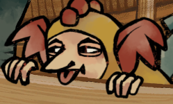
My design background is in making silly memes… maybee the bee could have a little more haw in it so I “designed” this:

It think tweaking the specific shade of yellow to get better contrast is a good suggestion, I just lifted the shade from the community icons and ran with it haha. And I agree, this is very much a “bee” icon and not a “haw” one - you joke, but finding a way to incorporate a cowboy hat seems like a great idea to me!
Was going to say, the light theme definitely misses some accessibility standards. I’d opt for black text on the yellow buttons, and maybe tweak the yellow a bit darker for further readability.
Love the hat!
I think it looks like a butt sitting on a yellow table.
Yeah, that’s a butt.
Gasp, I’ve been found out!
Haha, I have nothing against butts, but…
Immediately saw a butt.
Well now I can’t unsee that lol
whole thing ruined now. you’re right, and i hate it
I came to say the same thing. It’s even more apparent if you have your display in black and white!
This is seriously impressive… I love it! I’m the director of a design agency as my day job and work with branding often. If someone hit me this as a client refresh or new brand option, I would be pumped. It’s clever, memorable, current and fresh.
I don’t know if it’s the look Beehaw are going for (I don’t know enough about the instance :) but this is strong enough to stand as primary brand mark for sure.
Only thing I would mention (which I think I have seen on the thread) is there may be some web accessibility issues on the colour contrast side of things, I would look to touch these up if it went into production.
You may be on the product side of things, but this is legit very accomplished work!
Kudos my dude… An epic job ;)
deleted by creator
Love this feedback, thank you! It’s a really interesting exercise, trying to make something that isn’t professional - I’ve worked so long in our modern “clean and simple” landscape that it’s tough to remember when I was younger, and things were more wholesome, simple, and authentic. I agree, for a site that is by definition “alternative,” these logos are a bit too corporate looking. Glad you like the theme though!
deleted by creator
Hey there! If you’re still interested in trying it, I just released a theme based on this post!
deleted by creator
Beautiful work! All the other admins will be waking up soon and, I’m sure, will want to discuss.
I appreciate the kind words Chris!
The white text on yellow background is hard to read.
I would suggest to change the yellow parts of the light theme to another colour, like brown or dark gold/mustard
No offense to you personally, but I really don’t like that kind of logo design. I feel it lacks personality and uniqueness. I’ve seen an awful lot of companies redo their logos along those lines and they were almost invariably worse than the original. I look forward to this trend coming to an end.
Using hexagonal shapes and yellows for UI elements is certainly fitting, though.
Yeah, I feel like it is trendy and would get lost amongst the sea of similar designs. So I think it fits with what OP was looking for, making it look “professional” and by extention legitimate. However I don’t really think that’s what is best. I like the little bee and his little hat. He’s friendly. This looks too corporate for my taste.
I would like to be very clear I think it looks great! It achieves what OP stated they were going for. It looks professional. I just think professional is a bit bland and not a change I’d be very enthused about. Perhaps I am in the minority however. It’s not like I would fight a change to this if it was decided this would be what is best for beehaw.
Yellow is a really difficult colour to work with when it comes to an accent in theme.
Instead of the backgrounds, being black and white, I’d suggest a charcoal and a tawny; give it a more homely feel; which is what Beehaw aims to be.
Looks great, needs some warmth
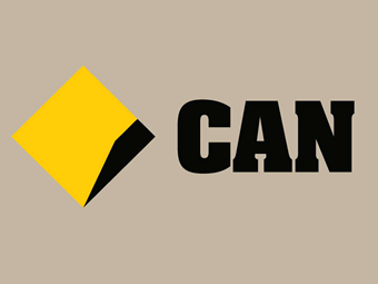
I’d maybe recommend copying the homework of Commbank
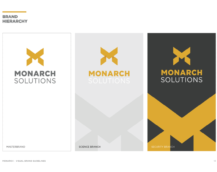
And Monarch from Quantum Break
What’s the Picasso quote? Great artists steal? :P This is a good suggestion, I’ll definitely try it out! I’ve long used #f7f7f7 for white and #1a1a1a for black, but breaking that dogma here could be valuable
This is the Fediverse!
We are not bound by petty conventions and copyright!
I like the idea of being able to side step the homogenisation of the modern web. BeeHaw is free to have a soul! And I’d like that soul to be cozy
This is absolutely gorgeous! Simplistic but also detailed in a nice manner. You have my vote for making this the official logo!
In the dark theme, the super bright yellow is distracting focus away from the content.
White on yellow is awful for readability and accessibility. Otherwise, looks pretty nice!
I like this because I can see the bee in it (when I know it’s meant to be a bee) but I think it’s lacking some more defined features because currently at a glance it just looks like a region of colour.
Yeah, I think for this I’d prefer something that is very specifically and obviously a bee. With a cowboy hat or something.
Love it <3
Amazing work
I just need lemmy to be more horizontal; use 100% width and use less lines.


