

I recall it had the mouse on it. Now I have the purple world.
Nothing gets past this guy.
( ͡° ͜ʖ ͡°)
His reflexes are too fast. He would catch it.
I think it looks way better!
Looks more professional but it feels… flatter. And less distinguishable from other apps. But it could just be my eyes.
You can also change the color of the icon on the settings.
Thanks. Tried it out. Looks great on brown. :)
Mines brown as well!
I agree. I like the concept overall but it does feel “off” compared to all the other app icons.
I hated the previous icon. The current one is nothing amazing but still better.
Devs are open to good submissions for icons. Any designers out there?
Maybe can there be a feature to change the icon? Would be very grateful.
There is an icon selector in settings
Like in apollo, we can select icons. Maybe that can be implemented in the future. :)
Although the current icon is nice, it would be cool to have some additional icon design options in the future! Just wanted to put that out there, loving the app! ❤️
Devs are open to good submissions. Good icons are over $1000 to commission so not a priority.
Apollos dev paid for all those icons.
Maybe as a community effort then. Rather than bought.
Btw, I didn’t knew they were that expensive, for such tiny art, especially for a free non profit software.
I’m thinking maybe the Apollo one was that expensive because it has to incentivize users to subscribe and pay?
One of the Memmy devs actually said that was the cost when they looked into it to get good ones. Of course, Memmy doesn’t make a lot of money.
Not sure what Apollo paid but, Apollo brought in a lot of money and could afford it. Christian must have seen the icons as a good investment.
Ahhh that explains it. Though, forgive the impudence, but I certainly do hope that a flat planet with few circles doesn’t cost 1,000USD.
The cost of designs like that aren’t necessarily to do with the size of the icon, they’re to do with the expertise and years of practice a designer has to work for to be able to understand how to make an icon that looks professional, legible at a small size, works with the branding of the app/company, doesn’t come too close to other companies icons, and that the user is happy to have on their Home Screen.
It also has to look alright at larger sizes in certain cases.
The planet icon probably didn’t cost $1000, and you can tell and that’s why you’re posting about it.
Unfortunately, the annoying part about designing app icons is that when it’s really good, the user won’t even notice it, because it’s designed to not stand out from your Home Screen and become an eyesore.
It’s a tricky situation 😂 and the reason I did years of design school but never actually ended up becoming a professional
It was done for free
This was my thinking too, if something were to be made by the community that was of sufficient quality, they would be welcome contributions!
I liked the mouse, I will accept the planets
I really love the old logo but I’m not a fan of new one but I see the appeal
Love the app. The new icon I don’t love
So much better than the previous icon. I like the pride themed version with rainbow colors most.
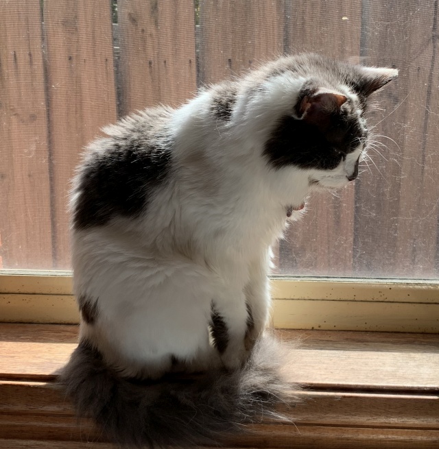
This screenshot says so much about you of almost feels like doxxing lol
Changed it just to be safe. Thanks for the reminder :)
Bruh, this looks like Samsung Internet
I want the mouse back.
I wish I could go back to the mouse or some other “pet” animal, the planet is so boring and random.
Yeah, not to discredit the work of whoever made it but maybe they could add an option to choose the older icon. Best of both worlds as those who love either can choose.
While the previous icon wasn’t the best, it had more character imo. This one feels generic and looks too much like the Samsung internet icon.
Ahh now that you mentioned it, now I know why it feels like it doesn’t stand out much. It feels too much like a browser icon. Thanks. This has been nagging at me since I first saw it.
The update also allowed me to upvote comments so I’m happy about that!


![Has Memmy changed its icon? [App Store]](https://lemmy.world/pictrs/image/68818bd2-9fcd-4873-888f-a5462e2e9072.jpeg)