
Since I received some negative criticism (but also some positive remarks) about the profile actions which were moved in the floating action button in this week’s release, I am planning to iterate over in for next week’s release and I need your opinion.
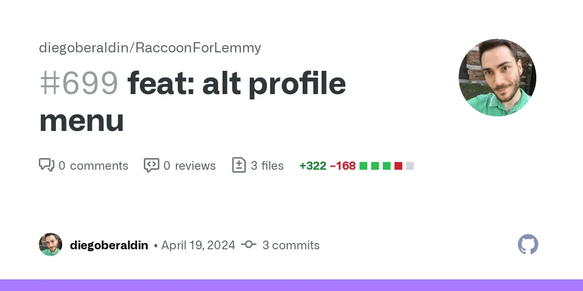
Instead of using the FAB or having it all always visible, I propose to you to use a side menu from the right side, as implemented in the following pull request. Would you mind having a look at the video on GitHub and give me your opinion? I’ll leave two comments below here and will decide what to do based on the number of upvotes of the individual comments.
Thanks to everyone who participates!
You must log in or register to comment.
Option 3: I want everything always visible as in version 1.9.0
Option 3 also, much prefer as it is in Ver: 1.9.0, it work’s, its visible, I don’t see the need for change…
You can always just scroll down to hide those buttons since the view isn’t locked. If only the bottom-half of the screen scrolled and the menu was always visible i could understand the complaints.
Honestly, I doubt people will spend that much time on the profile page such that we need to optimize its screen real estate. It’s more important that they can find what they’re looking for the first time they visit the page since they probably won’t go to it too often. That’s just my opinion though, maybe other users spend all day on the profile page.
I will say though, your mockup of sliding the menu out from the right looks great, I just don’t think it’s needed on the profile page.
I implemented it as a reusable component just in case it is needed elsewhere… btw technically I could leave both options and make it configurable in the settings screen but that seems a little an overkill. I’ll leave the poll open and then trow away what loses.
EDIT: The sliding side menu will be used probably for community info and user info, it was fun to implement and I’m going to keep it 😉
Option 2: I want the actions in the side menu (like in the video on GitHub)
I liked how it looks in the video, especially with the text next to the icons to say what it dose. ( I totally wasn’t logged out by mistake when checking the profile and not knowing what that button did) It looked better in the video as everything looked to have a bit more breathing room.
I am however not able to update from 1.9.0, it doesn’t show up in the play store, so I don’t know how the floating button option looks.
I’m not opposed to keeping it as it is/was in 1.9.0 but then I would really like there to be a confirmation before logging out.
I forgot to mention, intermediate (weekly) snapshots are not published in the Play Store but I upload APKs directly on GitHub for those who want to try the app out. Only version
1.10.0-20240417-prehas this floating action button profile thingy.Thank you for explaining, it makes a lot of sense.
I’ll do it! Thanks!
For the record, I managed to put it above the bottom navigation, just like the regular drawer and the result is better in my opinion.
Poll ended! I’ll bring everything back to how it was in version 1.9.0 and consider this topic closed.
Option 1: I want the actions in the floating action button