mac@programming.dev to UI/UX@programming.dev · 5 months agoIn Loving Memory of Square Checkboxtonsky.meexternal-linkmessage-square16fedilinkarrow-up175arrow-down11cross-posted to: hackernews@lemmy.smeargle.fans
arrow-up174arrow-down1external-linkIn Loving Memory of Square Checkboxtonsky.memac@programming.dev to UI/UX@programming.dev · 5 months agomessage-square16fedilinkcross-posted to: hackernews@lemmy.smeargle.fans
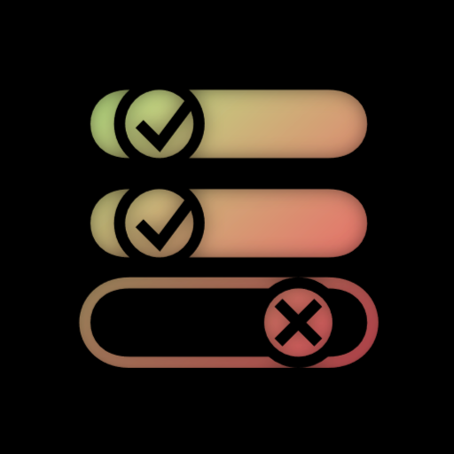
minus-squaresjpwarren@programming.devlinkfedilinkarrow-up23·5 months agoWith the wrong color scheme its really hard to know if its’ ON or OFF
minus-squarebleistift2@feddit.delinkfedilinkEnglisharrow-up4arrow-down3·edit-25 months agoThe background (green in the image) is usually a darker shade than the knob. That’s how you can tell the moving thing apart from the depressed background even if you’re color blind. Edit: Just realized that that wasn’t the point… Thanks, downvoters!
minus-squareAnUnusualRelic@lemmy.worldlinkfedilinkarrow-up5arrow-down1·5 months agoWhatever the colour scheme. Because you’re not in the designer’s mind. Unless they add redundant text, there’s just no way to tell. I fucking hate those things.

With the wrong color scheme its really hard to know if its’ ON or OFF
And some people are color blind
The background (green in the image) is usually a darker shade than the knob. That’s how you can tell the moving thing apart from the depressed background even if you’re color blind.Edit: Just realized that that wasn’t the point… Thanks, downvoters!
Whatever the colour scheme. Because you’re not in the designer’s mind. Unless they add redundant text, there’s just no way to tell.
I fucking hate those things.