Welcome to this session! For the whole day I’ll be looking at the replies to this thread and answer your questions. If something remains unanswered, replies can be posted even during the following days.
There are no rules, “anything” is anything! Use a grain of salt and a little bit of irony, though. Also, I would really like to hear something in your native language on your first comment: it can be a greeting, the question itself, a joke, an insult or anything crosses your mind in that moment. Have fun!
Compared to another app say Eternity, I get the feeling that Raccoon wastes less space. Particularly I have seen the wasting of space in apps that unusually tom tom their Material design.
Do you know why does it appear like that? And is there no way for a user to adjust padding?
Raccoon is implemented using Jetpack Compose for the UI layer and the Material 3 libraries (some components like pull-to-refresh are in falback mode on Material 2, though) so it should respect the guidelines, e.g. for text fields, bottom navigation, navigation drawer, top application bar, etc.
Where there were blatant violations it has been reported and fixed in the past, e.g. here, here or here. However if you are referring to post layout, the choices are not configurable except for full-width images.
There was a graphic designer once who told spacings were “all wrong” but when asked for suggestions he disappeared. If we could isolate the most painful points and make targeted interventions, it would be super. The next months are going to be dedicated to stabilize and improve the app rather than adding new features.
I would be most happy if you do not increase empty space further 😃
Good timing! I’m updating one of the UI elements to use a newer library, which increased the spacing a bit on its own.
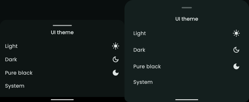
I’ve attached an example here, so you can see the before and after.Please bear in mind
- Spacing around the handle comes that way
- The library is currently bugged when it comes to detecting the nav bar height, so I had to set it to clear the 3 button nav bar
Finally, it may be possible to add a setting to configure the spacing in the app - we would likely need to define a few different
Spacingdefinitions (compact, medium, airy?)… While not a priority at this exact moment, it may be worth creating a feature request!
 —
—


