

Transcribed:
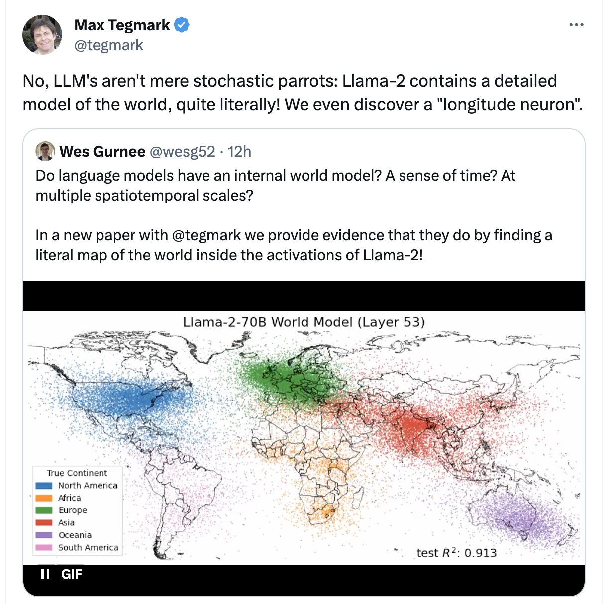
Max Tegmark (@tegmark):
No, LLM’s aren’t mere stochastic parrots: Llama-2 contains a detailed model of the world, quite literally! We even discover a “longitude neuron”Wes Gurnee (@wesg52):
Do language models have an internal world model? A sense of time? At multiple spatiotemporal scales?
In a new paper with @tegmark we provide evidence that they do by finding a literal map of the world inside the activations of Llama-2! [image with colorful dots on a map]
With this dastardly deliberate simplification of what it means to have a world model, we’ve been struck a mortal blow in our skepticism towards LLMs; we have no choice but to convert surely!
(*) Asterisk:
Not an actual literal map, what they really mean to say is that they’ve trained “linear probes” (it’s own mini-model) on the activation layers, for a bunch of inputs, and minimizing loss for latitude and longitude (and/or time, blah blah).
And yes from the activations you can get a fuzzy distribution of lat,long on a map, and yes they’ve been able to isolated individual “neurons” that seem to correlate in activation with latitude and longitude. (frankly not being able to find one would have been surprising to me, this doesn’t mean LLM’s aren’t just big statistical machines, in this case being trained with data containing literal lat,long tuples for cities in particular)
It’s a neat visualization and result but it is sort of comically missing the point
Bonus sneers from @emilymbender:
- You know what’s most striking about this graphic? It’s not that mentions of people/cities/etc from different continents cluster together in terms of word co-occurrences. It’s just how sparse the data from the Global South are. – Also, no, that’s not what “world model” means if you’re talking about the relevance of world models to language understanding. (source)
- “We can overlay it on a map” != “world model” (source)
Not even that! It looks like a blurry jpeg of those sources if you squint a little!
Also I’ve sort of realized that the visualization is misleading in three ways:
haha I know (re precision) but I made that as a shitpost not an academic paper. besides, it’s about as accurate as the promptfans are
that animation… is, yeah. I’m reminded of watching someone eyeball stats on their model as they were tweaking parameters, trying to tamp down overfitting.
it’s also just such shitty science. “can we find some way to represent this data to conform to $x hypothesis?”, albeit that of course isn’t surprising from the P-Hacking As A Service crowd