

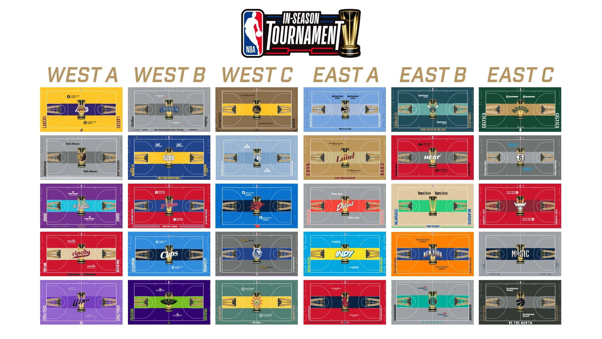
While they idea is cool, not all teams got a decent result…
deleted by creator
I legit on the small thumb was like, “Oh cool, OKC did the Native American theme again,” then Zoom in and holy F that’s bad.
deleted by creator
New Orleans got a bad one. So did Indiana.
I am irrationally annoyed that some teams have a logo in the middle and some have a city or team nickname. Probably because the Celtics are one of the teams with text.
deleted by creator
Some of them are pretty great, some of them are pretty bad (the Nets).
Personally I like Bulls and GSW, I really don’t like (my) Cavs and all the ones with too much contrast (Lakers), but then I see Washington’s non sense palette and…
Really like the Spurs one.
I was just thinking I hate it… Maybe I’m just old, but those aren’t Spurs colors for any color scheme they’ve ever had, and I’ve never seen that logo at mid court.