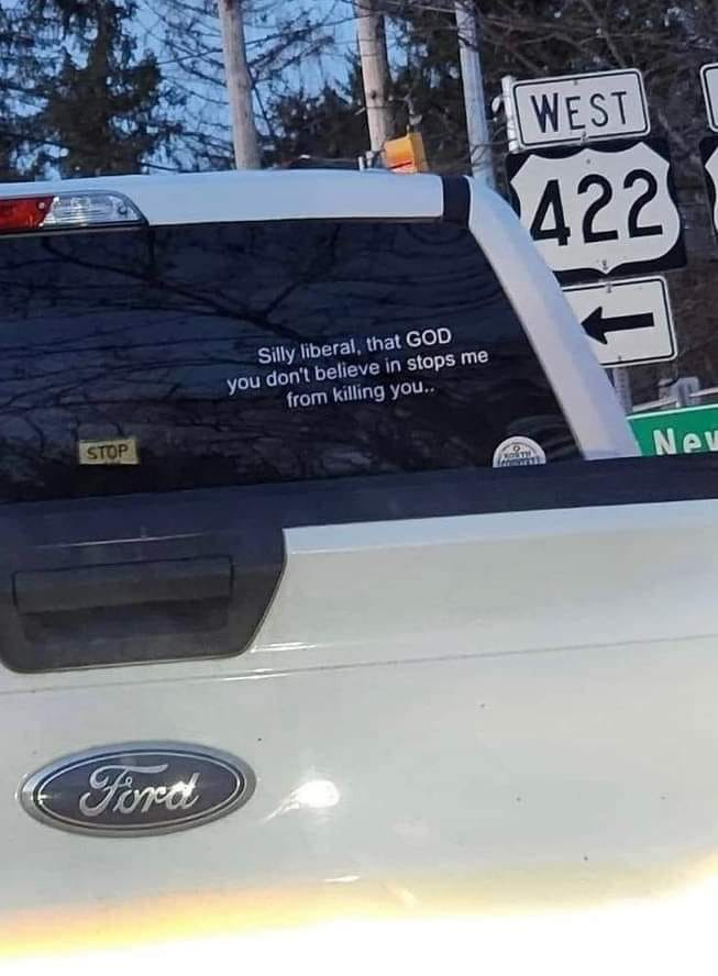
Yeah, I thought so as well when I first saw it. It’s a pretty obvious Photoshop job - the text is crooked, too small and, sadly, too educated in its prose.
We don’t need to invent fictitious things to find theism hypocritical or logically flawed, there’s plenty of truth out there to prove that.
By ‘crooked’ it means the lettering does not follow the curve of the surface it’s placed on. It’s a dead giveaway of an amateurish photoshop job. Most people know how to rotate a flat image but they don’t know anything about Bezier curves or using displacement mapping.
Do you even know how to read this analysis? It simply shows you the blocks in the JPEG that contain high frequency information, it doesn’t massively reveal areas that were edited. The documentation even tells you how to read it, but you obviously didn’t bother to reference it; you can only use it to compare areas with similar texture and edges to see if they have been compressed differently. Text and high detail textures are supposed to be highlighted because THAT IS HOW JPEG WORKS; it throws away information in uniform and low detail areas to save space, because human perception cannot tell the difference. This would only indicate manipulation if parts of the text contained less or more information than similar looking parts, indicating that someone e.g. took a highly compressed JPEG, added uncompressed new image fragments and compressed it again using high quality settings.
I really don’t care about this particular image, but you are claiming that you can tell fakes from reals by using an analysis method in a wrong way, and you didn’t bother to back up your claim, you just linked to an analysis which could cause people to jump to the wrong conclusion. This is how misinformation begins.
This effect is completely expected. Frankly, ELA seems like a crackpot analysis. At least you have to be REALLY careful when applying it to JPEG. You would need to have two similar looking bumper stickers of the same size and same level of detail in shadows in the same picture. Only if they differed significantly in the ELA could you maybe conclude something, but I still think it’s shit.
The method for producing these highlights is also really roundabout, since it just re-compresses the input and compares it with the original. A much more straightforward method would be to count the number of bits in each block in the raw JPEG data to get a measure of how aggressively the blocks were quantized.


deleted by creator
They even photoshopped the ford logo. Disgusting.
deleted by creator
Yeah, I thought so as well when I first saw it. It’s a pretty obvious Photoshop job - the text is crooked, too small and, sadly, too educated in its prose.
We don’t need to invent fictitious things to find theism hypocritical or logically flawed, there’s plenty of truth out there to prove that.
When you’re over-qualified for the job
I wouldn’t use crooked text as an indication of fakeness. I see morons with the “new driver” stickers putting them on crooked more often than not.
By ‘crooked’ it means the lettering does not follow the curve of the surface it’s placed on. It’s a dead giveaway of an amateurish photoshop job. Most people know how to rotate a flat image but they don’t know anything about Bezier curves or using displacement mapping.
“well, akshuallly…”
Do you even know how to read this analysis? It simply shows you the blocks in the JPEG that contain high frequency information, it doesn’t massively reveal areas that were edited. The documentation even tells you how to read it, but you obviously didn’t bother to reference it; you can only use it to compare areas with similar texture and edges to see if they have been compressed differently. Text and high detail textures are supposed to be highlighted because THAT IS HOW JPEG WORKS; it throws away information in uniform and low detail areas to save space, because human perception cannot tell the difference. This would only indicate manipulation if parts of the text contained less or more information than similar looking parts, indicating that someone e.g. took a highly compressed JPEG, added uncompressed new image fragments and compressed it again using high quality settings.
I really don’t care about this particular image, but you are claiming that you can tell fakes from reals by using an analysis method in a wrong way, and you didn’t bother to back up your claim, you just linked to an analysis which could cause people to jump to the wrong conclusion. This is how misinformation begins.
Edit: for reference, look at the ELA for this random bumper sticker: https://fotoforensics.com/analysis.php?id=0461290163af13fe55380b661fc1bf9d5d56a020.463104&show=ela
This effect is completely expected. Frankly, ELA seems like a crackpot analysis. At least you have to be REALLY careful when applying it to JPEG. You would need to have two similar looking bumper stickers of the same size and same level of detail in shadows in the same picture. Only if they differed significantly in the ELA could you maybe conclude something, but I still think it’s shit.
The method for producing these highlights is also really roundabout, since it just re-compresses the input and compares it with the original. A much more straightforward method would be to count the number of bits in each block in the raw JPEG data to get a measure of how aggressively the blocks were quantized.
deleted by creator
This website is great! Thanks for the heads up.
not that I don’t believe you but what is that link supposed to prove?