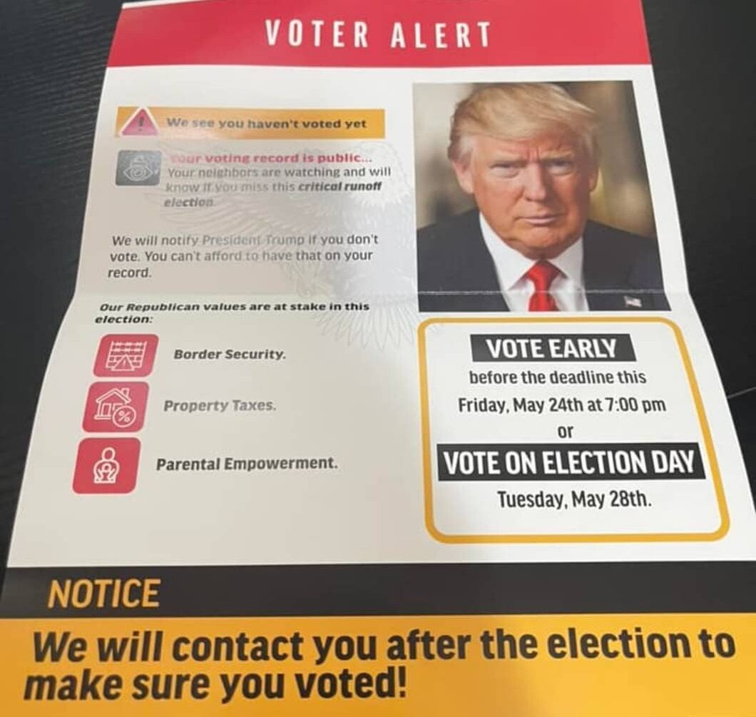
Note: some slight edits have been made in the image description to aid in readability by screen readers. Specifically, the values listed have been enumerated for clarity and the specific symbols used as warning symbols have not been explicitly described. Additionally, some of the text formatting has not been carried over in this description. For example, the title (VOTER ALERT) is in large white text over a red banner at the top of the flier. It is my hope that leaving these particular descriptions out will aid in understanding the flier itself; however, should anyone prefer a description of these formatting choices I will be glad to attempt it.
You must log in or register to comment.

