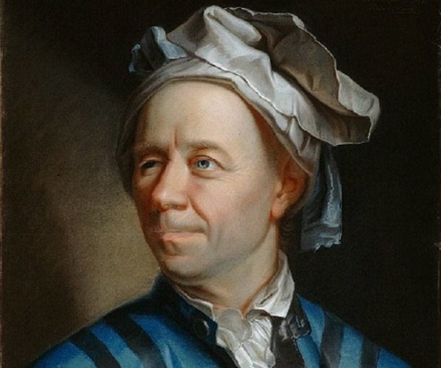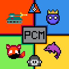

They turned out pretty nice! My only suggestion isn’t really AI related, but regarding the logo over it
The white border helps the black logo stand out, though maybe having an additional drop shadow could help it pop out a bit more, though that might be unnecessary. Just something I like to do when Photoshopping, but it’s purely personal preference! It certainly looks good, even without it.


Of course! I can help try my hand at it