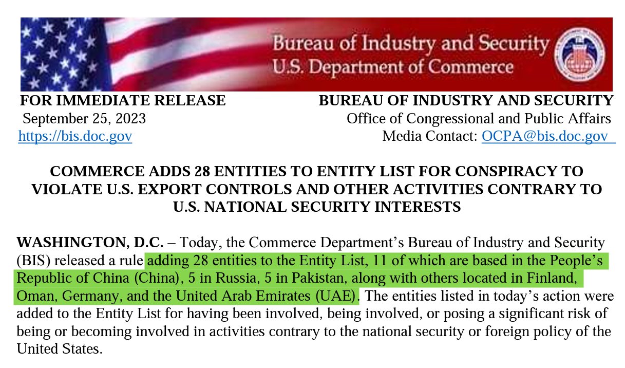
Seen here
One day the west may be in this chart, and it’ll probably be too late for us to change our behaviour, for now we claim that we’re doing this for the own good of their population, or that our national interest is aligned with the common good, or w/e :
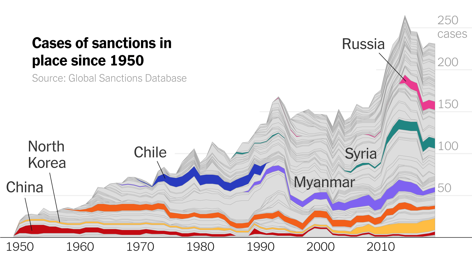
So Russia is indeed more sanctioned than DPRK? Eeesh, I was starting to think it’s an exaggeration
I can’t remember where i found a link explaining that the number of sanctions didn’t necessarily implied something about their intensity, but yeah, this kind of picture was quite widespread last year. Also, North Korea’s isolation from the global economy gives less room for sanctions.
In 1984, you have three sides who hate and don’t interact with each other, i’d certainly prefer cooperation instead of always more suffering and destructions.
Aye, figured as much, given the still active trade between Russia and the sanctioneers.
Well duh, you’re a socialist. We know cooperation is better
Wait, is that what the graph is showing? From what I understood the y is the total of the us sanctions, so the bigger the bar there the more sanctioned a country is presently, and even though I can’t see an actual number the better Korea does seen to have the biggest bar in the end.
Now that I looked at it once again, it seems the position on the graph is based by when the sanctions began, which is why Russia is so high because they only started in the 90s while China has had then since the 40s.
Pretty messy graph overall.