

Edit: This link is outdated, see new poll here https://programming.dev/post/190520
Hey everyone
Wanted to run a poll about the community icons to choose between a couple options
Option 1 - Use UBP icons - Use unified icons for all of the communities similar to beehaw
Option 2 - Use UBP for general communities and specific language, etc. icons for specific communities
Option 3 - Dont use UBP icons
Vote using the strawpoll here (doing strawpoll so it can be ranked voting) [removed in favor of new post]
EDIT: I have remade the poll with two more options. If you voted in the previous one please vote again in this. The new options are just for adding different colored gradients to the unified icons for different communities
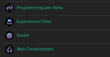
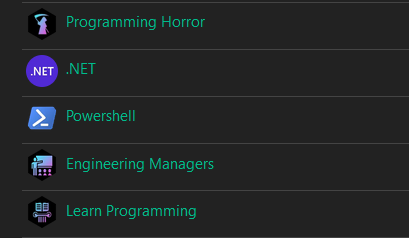
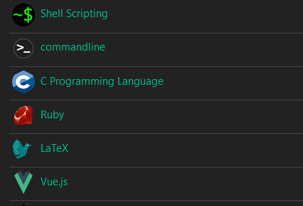
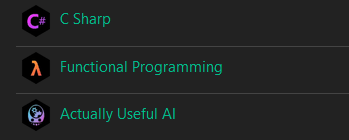
Quick example of this:
I think this should be done via CSS, rather than baking in the masked shape into the PNGs. We could customize our instance’s default bootstrap theme for Lemmy-UI. This would allow us to keep the icon artwork unaltered as full-size square canvases, then mask them client side based on the user’s preferred theme or custom layout. E.g. allowing the user to distinguish user avatars versus community icons based on masking shape, like on GitHub.
There is a growing development of RES like user side enhancements for Lemmy:
While I personally like the idea of having the shape be decided by user/instance CSS choices, would that not potentially reduce the immediate brand recognition, when those outside our instance see our community icons?
Yes letting everyone choose their own icon shape is a great idea, and thanks for sharing that script, I’ve been missing the compact view!