Edit: This link is outdated, see new poll here https://programming.dev/post/190520
Hey everyone
Wanted to run a poll about the community icons to choose between a couple options
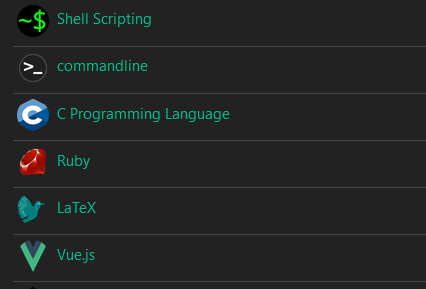
Option 1 - Use UBP icons - Use unified icons for all of the communities similar to beehaw

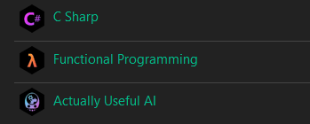
Option 2 - Use UBP for general communities and specific language, etc. icons for specific communities
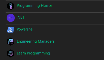
Option 3 - Dont use UBP icons
Vote using the strawpoll here (doing strawpoll so it can be ranked voting) [removed in favor of new post]
EDIT: I have remade the poll with two more options. If you voted in the previous one please vote again in this. The new options are just for adding different colored gradients to the unified icons for different communities
Quick example of this:


I have a question. If these were the final results (in descending order of votes):
Where y1 + y2 > x1 + x2, so more people wanted UBP everywhere but because of the two independent options (where to use them and what color), their votes got fragmented, what is the right course of action?
I think it would have been better to have two polls, one about the question of using visually consistent icons and another one about what they should look like.
Looks like strawpoll.com is simply ranked only, not necessarily RCV. True RCV could solve this problem by allowing instant runoffs after closing polls:
This one also supports randomized ballot order, which is cool.