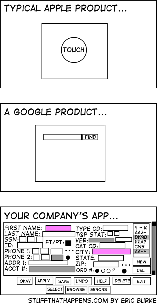
Honestly, I’d rather have an ugly app with everything right there than the terrible UX trend that’s happening of everything being hidden behind 8-10 different menus just to make the home screen “clean”
It would be hilarious if all these apps were secretly just like vim. They all have complex hotkey setups that enable power users to get where they need to be in at most 3 key presses.
And the unititiated has to google to find where their god damn setting is actually located.
Very often they do. Many of these internal applications are from mainframe computer times when interacting with applications exclusively via the keyboard shortcuts was the norm. In most companies, they never dared to remove those because the Power Users are used to them for decades.
Problem is, few people are trained directly by those power users so they never learn those efficient shortcuts. And they are never well documented.
One of my favorite extensions is vimium. It enables vim like navigation on web browsers. If you press ? It brings up a menu showing all the key bindings, it’s very helpful. Adding that and a hotkey highlighter would be a good way to document such programs. It’s too bad that sort of thing isnt a priority
We’ve removed critical functionality from the operating system because our boss didn’t want more than 6 buttons on screen at any time. Sorry the system is 100x more difficult to use!
On the one hand most power users feel this way. On the other hand power users probably aren’t the majority of users (although it depends on the product).
The trend definitely comes from the fact that new people get overwhelmed by cluttered user interfaces. But just having a clean initial screen doesn’t mean good UX. Good UX is the art of providing a clean, logical user interface that’s simple and efficient to use. Unfortunately, too many companies just go for minimalism and wind up with things both taking longer and ending up being harder to use.


Honestly, I’d rather have an ugly app with everything right there than the terrible UX trend that’s happening of everything being hidden behind 8-10 different menus just to make the home screen “clean”
It would be hilarious if all these apps were secretly just like vim. They all have complex hotkey setups that enable power users to get where they need to be in at most 3 key presses.
And the unititiated has to google to find where their god damn setting is actually located.
Honestly that would be great.
Very often they do. Many of these internal applications are from mainframe computer times when interacting with applications exclusively via the keyboard shortcuts was the norm. In most companies, they never dared to remove those because the Power Users are used to them for decades.
Problem is, few people are trained directly by those power users so they never learn those efficient shortcuts. And they are never well documented.
One of my favorite extensions is vimium. It enables vim like navigation on web browsers. If you press ? It brings up a menu showing all the key bindings, it’s very helpful. Adding that and a hotkey highlighter would be a good way to document such programs. It’s too bad that sort of thing isnt a priority
Yeah, or like having a separate screen for entering your username and one for entering your password …
We’ve removed critical functionality from the operating system because our boss didn’t want more than 6 buttons on screen at any time. Sorry the system is 100x more difficult to use!
On the one hand most power users feel this way. On the other hand power users probably aren’t the majority of users (although it depends on the product).
The trend definitely comes from the fact that new people get overwhelmed by cluttered user interfaces. But just having a clean initial screen doesn’t mean good UX. Good UX is the art of providing a clean, logical user interface that’s simple and efficient to use. Unfortunately, too many companies just go for minimalism and wind up with things both taking longer and ending up being harder to use.