
Edit: This link is outdated, see new poll here https://programming.dev/post/190520
Hey everyone
Wanted to run a poll about the community icons to choose between a couple options
Option 1 - Use UBP icons - Use unified icons for all of the communities similar to beehaw

Option 2 - Use UBP for general communities and specific language, etc. icons for specific communities
Option 3 - Dont use UBP icons
Vote using the strawpoll here (doing strawpoll so it can be ranked voting) [removed in favor of new post]
EDIT: I have remade the poll with two more options. If you voted in the previous one please vote again in this. The new options are just for adding different colored gradients to the unified icons for different communities
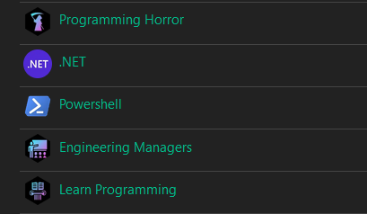
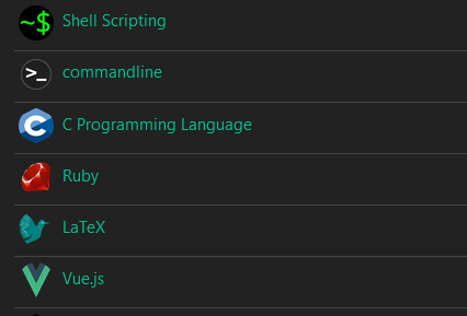
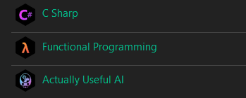
Quick example of this:
You must log in or register to comment.
I like the bottom one the best (option 3) for the reason that they have different colours. The colour tells something about the community you’re looking for.
A 4th option where you still have the UBP icons, but with the colours as shown in the bottom picture would be a good middleground. (Option: ‘Use UBP icons everywhere but with different colored gradients’)
just my two cents
Actually yeah true, forgot to add that to the poll. I can remake it real quick
I can’t vote due to VPN, but the UBP icons look awesome, and I think using them across the board will look great. With specific language icons, can still use the actual icon with the modified color gradient (like git community is) and still gets the point across and looks great IMO.
Maybe just let each communities decide? If some want to have a uniform theme between them let them have it and if others don’t too. Like, I wouldnt like to see any style, or lack of, being enforced on anyone.
Ill switch all the icons according to what gets voted on. Will leave voting open for a day
Can you elaborate on the option of UBP but with different gradients?
The wording of the options is a little confusing.
Yeah I just edited the post to do a quick example
Just means that instead of the usual blue purple gradient communities all have their own color scheme to separate them from each other
ex. the godot icon may have the godot colors, functional programming will have an orange gradient, etc.
Wow, the multi color gradients per different community is rather clean, but still aids in rapid legibility. Still think shape masking should be left to the user’s chosen theme or client side rendering, but the neon on black is warming up to me.
Due to issues with this poll would you guys be open to running it again on rcv123?
Things that would change
- Random ordering of options
- Better descriptions of options
- Handling so theres no accidental voting
- Better ranked system (transferable vote instead of points)
Yes! You could also change the post so all the options have a preview like you did before adding the new poll options. So changing “Quick example of this:” to "Option 4 - … "
Example
Option 1:
<image>

Option 2:
<image>

Option 3:
<image>
Might clear things up as well.
Yeah totally!
Better ranked system (transferable vote instead of points)
https://civs1.civs.us/civs_create.html ? or https://star.vote for scored ballots
deleted by creator
For context, check the comments here for the discussions behind proposed options:
I think the poll is too confusing with the 5 options of which are all very Similar, to be honest. Actually I’m already not sure what I’ve voted for and it’s just a moment ago 😅
I would say just do what you think looks the best regards the poll.
I’m getting a timeout for the strawpoll. I don’t really care that much, but I think it’s nice to not use UBP. Variety is the spice of life.
I have a question. If these were the final results (in descending order of votes):
- x1 votes for UBP icons for non-language-specific communities
- y1 votes for UBP everywhere
- y2 votes for colorful UBP everywhere
- x2 votes for colorful UBP icons for non-language-specific communities
- z votes for no UBP icons
Where y1 + y2 > x1 + x2, so more people wanted UBP everywhere but because of the two independent options (where to use them and what color), their votes got fragmented, what is the right course of action?
I think it would have been better to have two polls, one about the question of using visually consistent icons and another one about what they should look like.
Looks like strawpoll.com is simply ranked only, not necessarily RCV. True RCV could solve this problem by allowing instant runoffs after closing polls:
This one also supports randomized ballot order, which is cool.
Also if a UBP option wins ill run another vote for hexagon vs circle
My top choice for icon shape is definitely the vertical hexagons we have now, but the poll should probably include options for both vertical and horizontal hexagons. Maybe square and squircle as well.
I think this should be done via CSS, rather than baking in the masked shape into the PNGs. We could customize our instance’s default bootstrap theme for Lemmy-UI. This would allow us to keep the icon artwork unaltered as full-size square canvases, then mask them client side based on the user’s preferred theme or custom layout. E.g. allowing the user to distinguish user avatars versus community icons based on masking shape, like on GitHub.
There is a growing development of RES like user side enhancements for Lemmy:
Yes letting everyone choose their own icon shape is a great idea, and thanks for sharing that script, I’ve been missing the compact view!
While I personally like the idea of having the shape be decided by user/instance CSS choices, would that not potentially reduce the immediate brand recognition, when those outside our instance see our community icons?
Gah, I messed up my vote. I clicked on the option I wanted (2) and then clicked vote.
I didn’t realise it was a thing where you had to drag the options into the order that you wanted.
Now I’ve entered a vote that is what the default order of responses is.
Not sure why the button is called “Vote” and not “Submit” if you’re submitting an order instead of a single vote.
I did the same. I submitted the default order without realizing that it was an ordered list.
Yeah, I suspect the current poll rankings are a little biased from the initial ordering of the ranked options. I think strawpoll.com’s website should randomize the initial ordering per voter, as well as ask the user to move options from one column to a second columb to make the UI more apparent that all options should be re-ranked by the voter.